About Empathetic Design.
Confidence is a strange thing. For some, their confidence can seem abundant while others wait timidly on the sideline. But one thing I've seen a few times over: the more confident a product makes the user, the more likely that product – and everything tied to it – will succeed.

Take a look at some of the notorious social media platforms: Instagram and TikTok. They have garnered a user-base numbering into the billions while their platforms keep growing. Every year, dozens of clones, copycats, and competitors try to launch in their space but end up failing. Why? The users have no confidence in the new product.
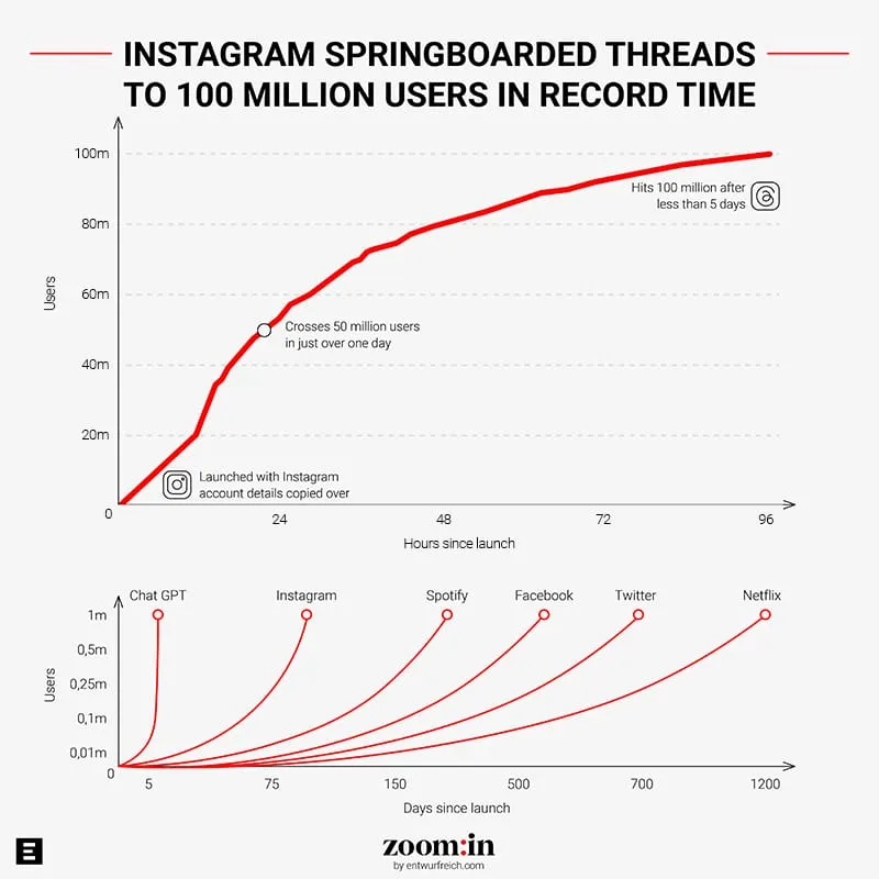
That is until Meta released their Twitter clone – Threads – to their US audience. The release was widespread and the growth was massive – if you had an Instagram, you could immediately have the same following on Threads. The simplified platform meant more people could do more with less technical or creative thinking – you could text, post links, upload a few photos – and that's about it.
No Algorithm to Beat
No stats to distract. A seemingly perfect scenario: a clean slate, a new medium, but your audience was still there. You didn't have to worry about the politics or instability of Twitter, but you still got the simplicity of a text-forward platform. Meta users across the board felt empowered for the first time in a long time.
In the early days, before sophisticated algorithms were worked into everything, everyone had an equal chance of reaching the same amount of people. If you had an internet connection, you could theoretically connect to every other person who also had a connection. On the other hand, as these platforms grew and got more sophisticated, the user experience was more manipulative. Sure, anyone could still gain a large audience, but the platforms favored the creators who had large audiences they could easily monetize.
This all gets me thinking of the baseline idea behind empathetic design: it needs to empower your user into thinking they can do more. The design needs to be intuitive, and people need to feel smart and savvy while they use it, but it shouldn't go so far as to leave the user feeling cheap or cheated.
More than ever, consumers want products that help define who they are. Every one of us has an allegiance to a certain brand for any one of a dozen reasons. You may like a certain clothing brand because of who else might be wearing it (celebrity or otherwise), or maybe you just like the way the blue fabric brings out your eyes. Some athletes wear Nike because Michael Jordan is so closely tied to the brand. Others buy Adidas because they love old-school Hip Hop and RUN-DMC.
Cars are sometimes bought purely from the testimony from someone you know – did it give them any trouble? How's the resale value? How does it handle in the snow? Consider the rise of the Apple MacBook. Not only did the company create something their fanbase was sure to love, but they gave an entire population of creative people a way to use digital tools that required minimal technical knowledge.
Apple empowered the user with empathetic designs. The bar of entry for artists to enter a digital space dropped significantly – musicians and painters and photographers now had a platform they could use to present their art to the world, and they didn't need to take a tech class to get there.
None of this was by accident. Apple didn't just design a great product, they designed a fantastic experience. The experience starts with Apple saying "What could you do if you had a tool like this?" and continued when the audience imagined where they could go if only they had the capabilities of the MacBook.
Without the MacBook, your doodles are stuck on paper and you might only have an open-mic night to share the songs you've written. Without a particular truck, you might not be able to drive the rugged roads that take you to the places you want to visit. Without a set of tools that enables you to take the next step, your customer feels stuck.

How To Apply Empathetic Design
1 – Find the pain points your audience experiences.
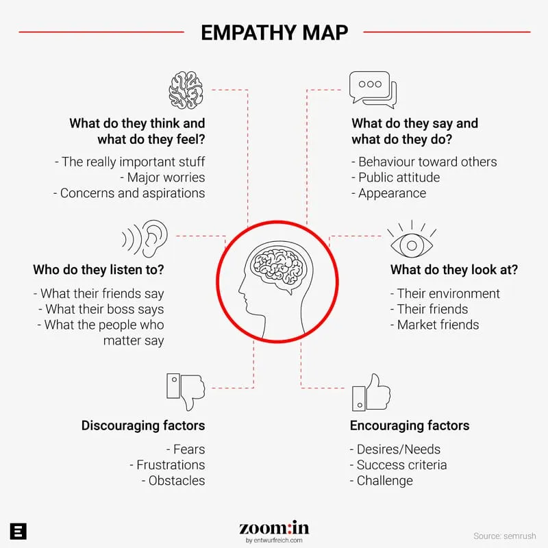
Every worthwhile solution solves a problem, and the problem is usually rooted in a deep-seated, emotional vulnerability. There is almost a bit of therapy to the process and something all of our clients experience in the discovery phase of our user-integrated process. Your product needs to solve the issue in a way that also addresses the vulnerability. For example: there are thousands of different accounting platforms out there and they do pretty much the same thing – help business owners keep track of their billings.
What makes them different? How they solve the problem. One person may need something high-powered and sophisticated to feel confident their numbers are correct. Another may need something that is basic but looks great, so they can send invoices without exposing to their customers that they are terrible at math.
2 – Product and Marketing need the same goal.
Smart companies know that marketing shouldn't wait until the product is finished. At the very least, your CMO should know the features of your end product so they can start developing conversations around it. If you want more empathetic design, marketing and product should be speaking to the same customer set at the same time. From collecting data about what your audience needs to identify gaps in the market, looking at the same information puts both teams on the same path.
The end result is the same: Empowering your user! Give them something they can be excited to use. Give them something that finally lets them discover what they are capable of.
Threads quite literally came out of nowhere. It had a short launch window and it took off like wildfire because the teams designed something that would be empathetic to the thing they knew their users wanted: the features of Twitter that integrated with the audiences they had cultivated with Instagram. They saw the gap in the market (which only grew the more chaotic Twitter seemed to be) and created something that was familiar enough to their users while still feeling like a new experience. You no longer needed to be a visual brand, and visual brands now had a way to create something for a new audience.
What does your product empower your user to do? Does it happen? If not, there may be a gap in your empathy.


