Minimalism has a sexy appeal that some people find irresistable. You might conjure up ideas of something that is sleek and spartan, something streamlined and highly efficient. Pop culture had a small love affair with minimalism – with the rise of personalities like The Minimalists and Marie Kondo – who spoke of the idea: Better Living Through Having Less Stuff.
While the idea of minimalism can apply to just about anything, when it comes to design so many of us tend to think in the same terms. The minimalism behind design might get you thinking about monotone colors or only needing a single button to do everything. But a minimal aesthetic doesn’t mean much if the product doesn’t accomplish the one thing it needs to do: satisfy your user. True minimalist design serves the end user – everything else is just filler.
The design of anything – from the layout of the room, your company logo, or your flagship product – is only truly minimal if it satisfies. When your customer is satisfied, everything else tends to fall in line, and you eventually find out how true satisfaction is sustainable.
Removing Features vs. Reducing Excess
I came across a YouTube video of someone who was giving up their smartphone for 30 days. Instead of the feature-rich device they used every day, they adopted a “Light Phone” – a stripped down version of a cell phone resembling a Palm Pilot from the late 90s. The Light Phone had a monochromatic screen and minimal applications – phone calls, texting, alarm clock, music, and – for some – navigation (although the directions were sometimes tough to follow). I can’t imagine anyone in my immediate circle giving up their phone for a day, much less 30, much less replacing it with a device that did the bare minimum. The world around us demands we have a smartphone on us so we can access everything from a cab ride, shopping for groceries, paying for movie tickets, and connecting with friends.
Is this Light Phone a minimalist product? Probably not. Of all things, it’s a niche product that serves a very small demographic. Removing distracting features is only effective if the removed features are in excess to the function of what you need the phone to do. And “what I need my phone to do” varies widely from one person to the next.
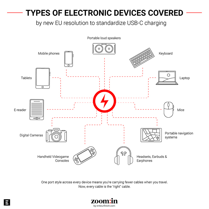
For example: with the EU standardizing USB ports across new electronic devices, manufacturers are shipping their products without chargers. Of course, you can still buy a charger if you need one. Chances are, you already have a cable that will fit the port perfectly. When one end of a cable is standard, you remove the need for a user to carry around several cords – this is a reduction of excess which will end up saving customers to the tune of 250 million euro a year. Not to mention, it will prevent nearly 11,000 tons of e-waste each year.
Customer Satisfaction
More about the Light Phone: most customers go back to their previous device (the guy on YouTube did). A product, minimal or not, fails if it doesn’t satisfy the customer. Going further on this idea, a truly minimal product gives the customer a sense of “this is it, this is all I need, this is perfect.” Minimal design means the product serves all of the customer’s needs and doesn’t have any of the “but I wish it also did/ didn’t have this component.”
Some computers are shipped with bloatware preinstalled. Some pens have the perfect flow of ink, but the clip is in an awkward spot. No one wants a product that is 80% perfect – yet that’s what most of us end up settling for in the best case.
What would it look like to provide something that just satisfies? Imagine what it takes for you to be totally and completely happy with a purchase, a product, or an experience? It’s not necessarily an overwhelming feeling. I think it’s more sublime – like a meal that resolves your hunger without leaving you feeling bloated.
We go beyond trends – we innovate.
Get news and ideas from ENTWURFREICH
Market Longevity
This is a difficult one to approach, especially when talking about the design and development of digital products. The only constant is change, and new technology will continually replace the old as the demands of the day and customer preferences move around. Lately, it feels like they are moving faster than ever – but how do you know what is a foundational shift in the market versus a passing fad?
I’m thinking about the shovel in my garden shed. The design of the shovel has largely stayed the same over the years because it only has one purpose: to dig. Of course, there are little modifications and variances we’ve seen over the years in response to the kind of digging you need to do: transfer shovels, spades, trenching shovels, and even post-hole diggers. Different designs, different functions, but largely the same purpose. And if you take care of the shovel, it may be the only one you ever have to buy.
Modern technology can follow the same trend – the minimalist application goes to the purpose of what you are creating, instead of the style or design. Televisions, for example, have had the same purpose: deliver content and entertainment to the masses. A TV from the 80s may still pick up a few OTA channels, but there isn’t a chance it could stream HBO or render a picture in 4K (or even 1080p).
Consider this against the typical Product Life Cycle Curve:
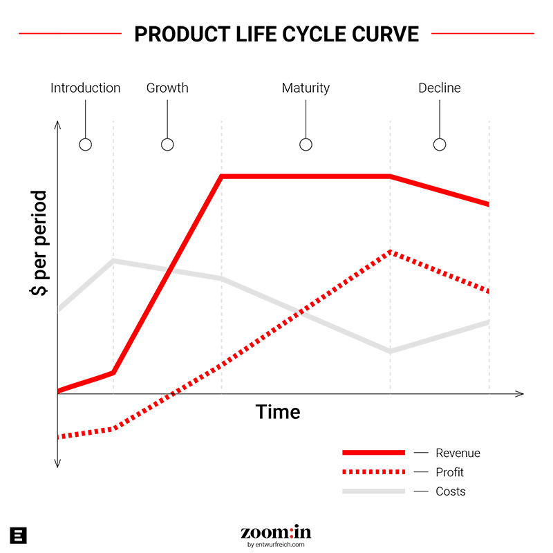
When a product is only designed to do one thing, it tends to stick around for generations. They aren’t solving an imaginary need or trying to convince people to buy the newest and most updated version. With the TV example: you no longer have to introduce the idea of “get content anywhere” to your audience. The new introduction might be “get content anywhere you are at any time” – on your phone! In the middle of a trans-Atlantic flight!
This is what happens when you design for the end user instead of trend – you get a minimal product that lasts forever. The product isn’t “television” or “tablets” – it’s “content delivery.” The longer your customer knows this product the longer they want it to last. This is the kind of emotional connection a truly minimal design can create.
And who doesn’t want a customer for life? For the longer you can keep your core customer base satisfied, the more you can learn about what they need. This is the line every leader needs to walk: how to solve more problems with fewer tools and features. Only expanding when you absolutely need to will keep your business streamlined and profitable – the benefits of minimalism!


